Idea and Concept
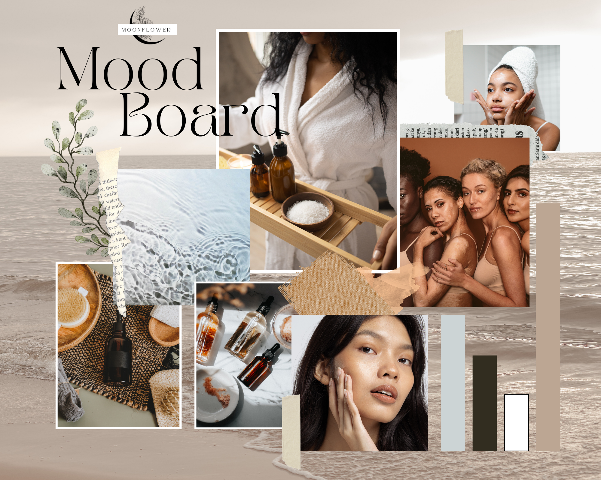
When a client approached us with their idea of creating a small batch, natural beauty and skincare line, we knew that we wanted to make tackle this project. They wanted their branding to induce be calm, clean, diverse, and natural. There weren’t that many restrictions when it came to color palette, and there weren’t a lot of reference photos and images that they already had. So, we took the opportunity to make a mood board for the client. Before we started on any other branding, we wanted make sure we were headed in the right direction.
In order to do this, we began compiling images, textures, and colors that we felt would evoke the proper feeling of the brand and meet the brand’s goals laid out by the client. Once these were compiled, we then formed a couple of different mood boards and presented it to the client.
Logo Design
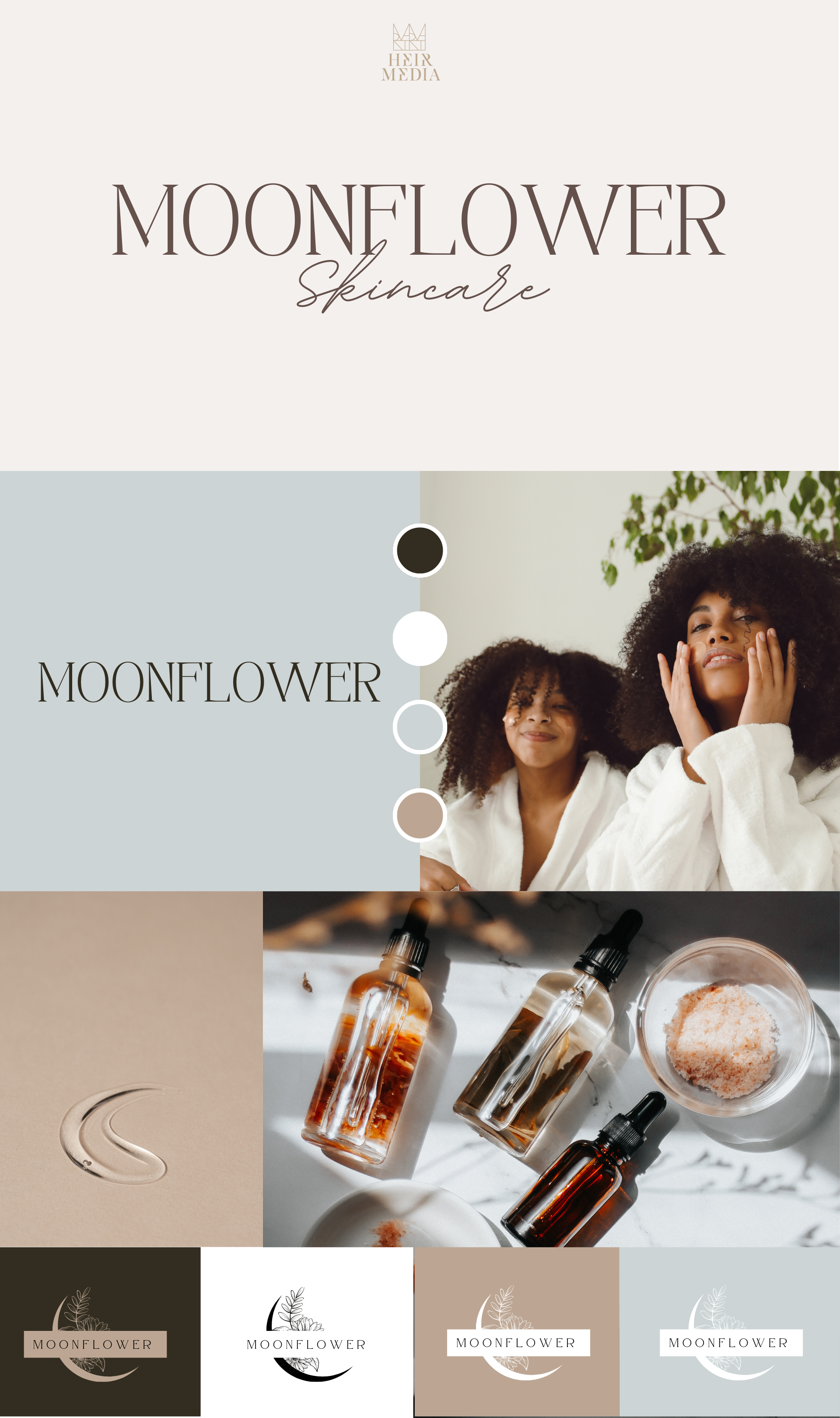
Ultimately, the client was interested in something simple and rather straightforward. We took the image of a crescent moon with a flower sprouting out of it, as the basis for the logo, and began playing around with different font types. The client did not want a 3D render or to have too many shadows on their brand’s logo, so we kept it simple in black, with a white letterbox and black text. This makes the logo easy to vary on a variety of products, digital sites, and OOH marketing tools.
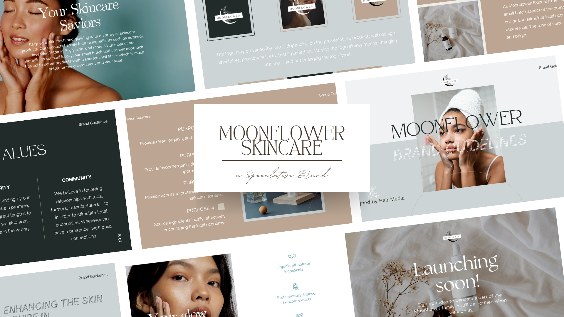
Brand Design
Another step that the client wanted, was a one sheet for their brand. This Brand One sheet would then be used internally to help their employees get a visual idea of what the brand should look like.
The Brand One Sheet, coupled with the Brand Guidelines, will allow the brand’s tone of voice, look, and feel to remain succinct and in tack throughout all marketing advertisements and collaterals, social media, and physical products. This 360° approach to design allows for the brand to be recognized by both its current and potential audiences; and it allows for their audience to better engage with the brand.
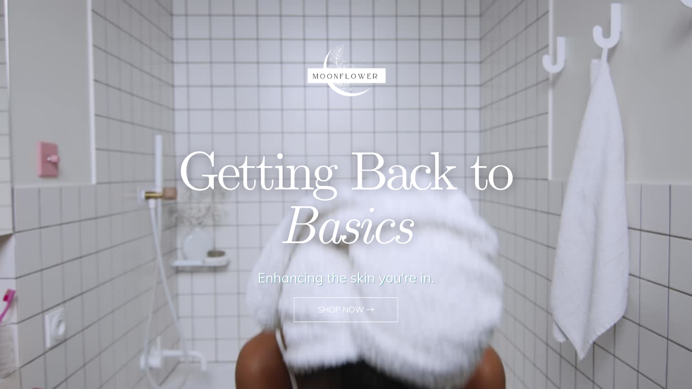
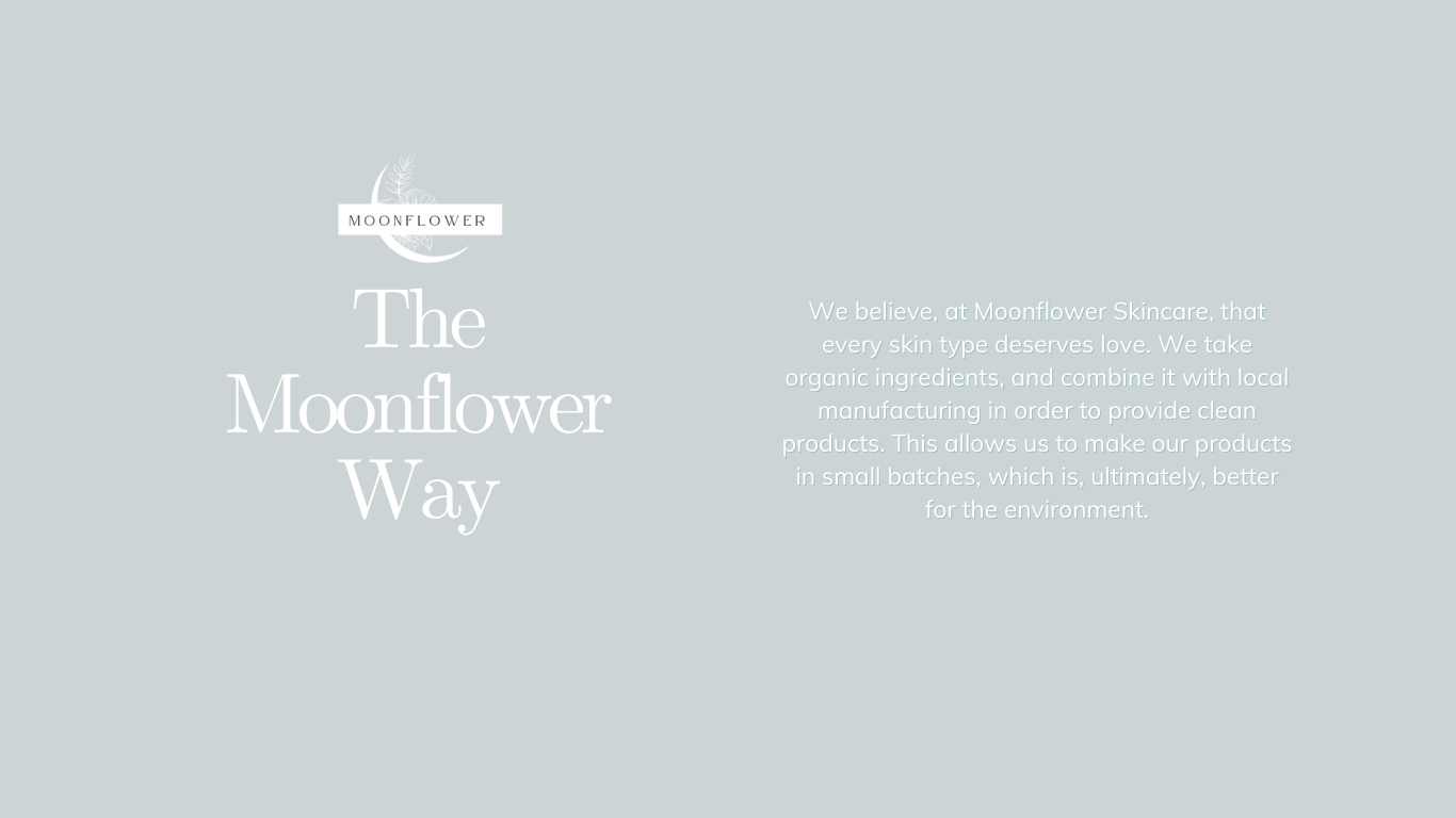
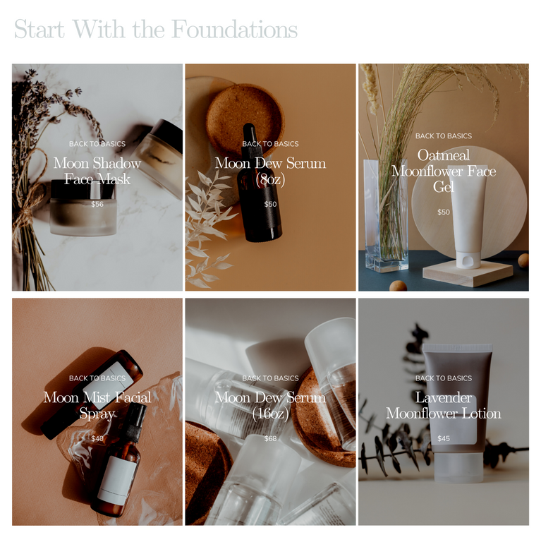
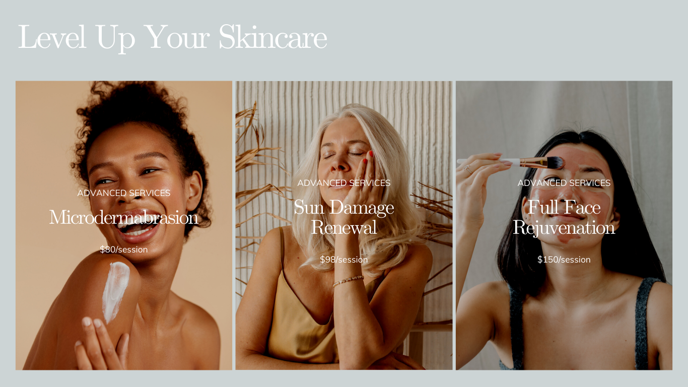
Web Design
One of the best ways to build brand recognition and engage with potential customers is through a website. We approached the website design as a continuous scrolling page. We wanted website users to use minimal amount of clicks to navigate the site, with only the shopping cart and account login, (featured in the final build) utilizing clicks to navigate to; everything else should be able to be engaged on the landing page.